Visualizing Ratings Distribution in a Dataset
Exploring Visualization Techniques for Ratings Data in Python
Introduction: In data analysis, understanding the distribution of ratings in a dataset can provide valuable insights. Whether you're analyzing customer reviews, product ratings, or user feedback, visualizing this distribution can help you identify trends and make informed decisions. In this post, we'll explore how to visualize the distribution of ratings in a dataset using Python.
Generating Random Ratings Data: To demonstrate this, let's first generate a dataset with 100 samples and random ratings in the range of 1-5. We'll use the numpy library to generate the ratings and the pandas library to create a DataFrame:
import pandas as pd
import numpy as np

# Expand dataset to 100 samples
data = {'reviews': ['review{}'.format(i) for i in range(1, 101)],
        'rating': np.random.randint(1, 6, size=100)}

df = pd.DataFrame(data)
1 20.0
2 20.0
3 20.0
4 20.0
5 20.0
Name: rating, dtype: float64Calculating Percentage of Each Rating: Next, we'll calculate the percentage of each rating in the dataset. This will help us understand the distribution of ratings:
rating_counts = df['rating'].value_counts(normalize=True) * 1005 28.0
1 24.0
3 18.0
2 16.0
4 14.0
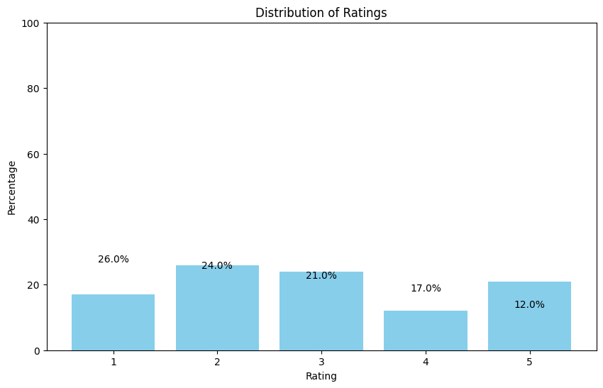
Name: rating, dtype: float64Visualizing the Ratings Distribution: We can visualize the distribution of ratings using a bar chart or a pie chart. Let's start with a bar chart:
import matplotlib.pyplot as plt

# Create a bar chart
plt.figure(figsize=(10, 6))
plt.bar(rating_counts.index, rating_counts.values, color='skyblue')
plt.xlabel('Rating')
plt.ylabel('Percentage')
plt.title('Distribution of Ratings')
plt.xticks(range(1, 6))
plt.ylim(0, 100)
for i, value in enumerate(rating_counts.values):
    plt.text(i + 1, value + 1, f'{value:.1f}%', ha='center')
plt.show()
Visualizing the Ratings Distribution (Pie Chart): Another way to visualize the distribution of ratings is to use a pie chart. This can help show the relative proportions of each rating:
# Create a pie chart
plt.figure(figsize=(8, 8))
plt.pie(rating_counts, labels=rating_counts.index, autopct='%1.1f%%', startangle=140, colors=plt.cm.tab20.colors)
plt.axis('equal')  # Equal aspect ratio ensures that pie is drawn as a circle.
plt.title('Distribution of Ratings')
plt.show()
Conclusion: Visualizing the distribution of ratings in a dataset can provide valuable insights into customer preferences and satisfaction levels. By using Python and libraries like pandas and matplotlib, you can easily generate visualizations that help you understand your data better.
Code: Colab Notebook


